

“Kind van de Nacht”: Netherlands Cover for “The Heir of Night”
Jun
05
2011
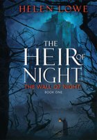
The Netherlands cover for Dutch translation of The Heir of Night, to be rendered as Kind van de Nacht in Dutch, arrived today—and it is very cool! So much so that I have to share it with you straight away. My Netherlands publisher, Luitingh, have used the blue USA cover (the artwork done by Greg Bridges) but introduced very strong, gold lettering for the title, with what I term a ‘beaten metal’ effect to the font. I think it is really funky and hope that Dutch readers will like it, too. 😉
The first Netherlands’ edition, which is to be published in hardcover, is scheduled for release in July.
And here, without further ado, is the cover:


Comments


I like the gold lettering for the title. Lovely cover!
Very cool. It almost has that cinema feel. Makes makes me want to by a ticket to check out the action!
Wicked! Very nice 🙂
Awesome! It’s funny, when I first saw it, I would have sworn it was different artwork, it seems so different with the new lettering. I love it. Is it an actual metal effect on the cover itself? Lovely.
Woo hoo! It must be a great feeling to have your work translated into another language – and of course I approve that Dutch was the first 🙂
Very cool.
Thank you all for your support for the Netherlands cover—I really do think it “rocks!” Btw, Wen, I think the background may have been lightened/brightened to go with the gold lettering, although I can’t absolutely be sure.
I love that font! great cover
Sharon: “I know”—I love it!
I like the gold lettering. The cover seems more spooky, even though I know “Heir of Night” is NOT horror.
I know what you mean, June: it hath a slight “vampyrish” feel to it.
I’m dutch and just loved the book cant wait for the second part to be published
John, Thank you for letting me know that you loved the book. It’s a few months yet until The Gathering of the Lost is due out (March/April 2012) but it is ‘done and dusted’ and on its way to you.:)