

Developing “The Wall of Night” Series Map

Map design by Peter Fitzpatrick
On July 26 I featured a post on world building in the context of The Wall of Night series and the world of Haarth, here.
As part of that post I included the image of the Wall of Night series map and today I thought it might be fun to focus in on the process of developing the map—both from my point of view as the author, but also from the viewpoint of the artist, Peter Fitzpatrick.
I hope you enjoy.
Introducing the Map: Helen Lowe
As a kid, I was fascinated by the maps in CS Lewis’s Narnia series, then as a teen graduated to the “real deal”, poring over JRR Tolkien’s maps in The Lord of the Rings. By that time the die was firmly cast: if it was epic fantasy, or pretty much any fantasy really, in my view the book had to have a map!
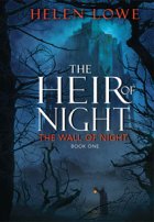
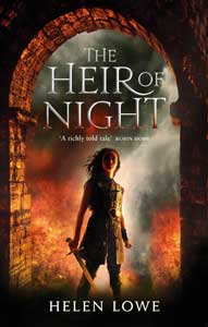
In The Heir of Night I introduced my own fantasy world of Haarth and from the beginning, there was always a “map”—but definitely not as readers of Tolkien or Lewis would recognise it. My “map” was crudely drawn compass points on a page, with rough scribblings that might, on a fair day and in a good light, be construed as mountain ranges, rivers, and—with considerable stretching of the imagination—keeps. As a writer, I could see the world of The Wall of Night and Haarth vividly in my mind and translate them to the page as words—but I couldn’t draw them. Scale and the cutting of straight lines both elude me: an artist, sadly, I am not.
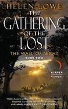
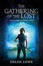
Fortunately for The Wall of Night series and the epic fantasy tradition of “the map”, I knew Peter Fitzpatrick, an artist with the talent and skill to transform my hopeful hieroglyphics into the mighty “world of Haarth” map that you see at the beginning of The Heir of Night and The Gathering of the Lost.
I will now pass you over to Peter, who will describe the process of developing the map to professional standard .
Developing the Map: Peter Fitzpatrick
I got the draft for the map from Helen as a small ballpoint pen sketch. Once we had gone over it together, noting any changes that needed to be made, I transferred the basic forms (coastline, hills, mountains, rivers and roads) to a larger format, about 400mm in diameter; just simple outlines at this stage, painted in indian ink on 300gsm watercolour paper. This basic map was scanned and brought into Photoshop for colouring.
I intended to do most of the work digitally, but I find that best results come from doing any initial designs in traditional media first, and all of the cities, the Keep of Winds, the border marker and so forth were sketched, inked and scanned. Also, I wanted the overall texture of the map to have a natural, organic look, so I made a series of watercolour washes, scanned them, and turned them into Photoshop patterns to overlay on the base map.
All of the shade and highlight modelling was painted digitally on a 50% grey layer over the colour and texture layers. The city sketches were digitally painted separately, then brought into the main image, resized and laid down in their appropriate places.
Place names were the last elements to go in. I created an OpenType font specifically for the purpose, loosely based on a traditional Celtic Roman face used in the Book of Kells and the Lindisfarne Gospels. The letter forms were first created in CorelDraw X3, and the whole font refined and exported to OTF format from Fontlab 4.
When it was decided that the map would be published in greyscale as a double-page spread with a rectangular border, I went back and adjusted all the colour to grey tones, deepening some and lightening others to make the image readable without any colour information. Some elements of the map had to be shifted slightly to accommodate the page fold, as otherwise they would be illegible or even disappear entirely. The decorative border was created in the same way as the map proper: a hand-drawn design, scanned and brought into Photoshop, digitally textured and painted to give it a bas-relief effect.
—
Note: the original version of this post first appeared on Harper Voyager's Out of this Eos
blog in 2010


Are you telling me that you allowed whole cities to be moved, merely to avoid a page fold?
What about the poor hardworking citizens?
I shall let Peter answer that one, if I can track him down… 😉
Wow, I’m posting in the future. Time Travel!
And yes, although the late Diana Wynne Jones rightly pointed out the problems of maps in fantasy novels, I expect and want a good map. Cartographilia, you see.
Yup, hang on to your Tardis there, Paul!
And speaking of Diana Wynne Jones, check out my Wednesday post…
wow, I didn’t understand any of that, but I love the results :)beautiful work
And in the end, it’s all about the result.:)